Plan B Learning Platform
UX & Product Designer → Head of Product & Design · Plan ₿ Network · 2023 – 2026
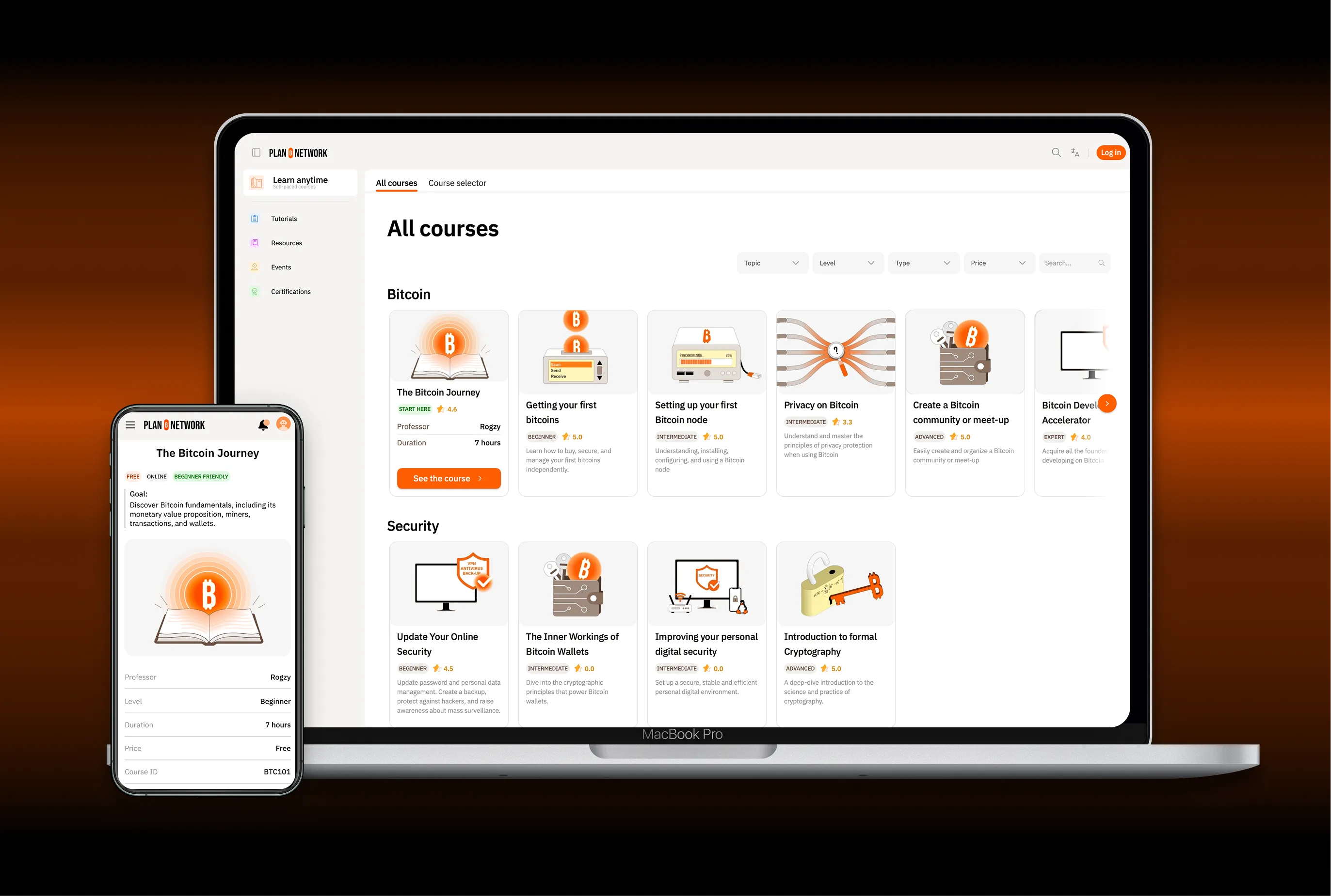
Context
I joined the startup Plan ₿ Network at the very beginning of the adventure, as a graphic and UX designer. A few months later, the founder asked me to also take on the role of Product Manager for the startup's flagship product: a SaaS B2C open-source e-learning platform, which grew from 0 to thousands of learners.
My dual background as an engineer and a designer proved especially valuable. It let me understand the developers' technical constraints, translate the founder's vision into concrete features, design the user experience and support the product's development all the way to launch.
This position at the interface between strategy, design and development gave me a global view of the product and how it was built.
Building a product as a team
We were a small team of six: 3 Front & Back-End developers, 2 designers and 1 maintainer, working fully remotely, in a startup context where the product was constantly evolving.
I gradually structured the work around regular touchpoints bringing together developers, designers and content creators. Before each significant feature, we took the time to discuss user needs, pedagogical stakes, technical implications and the consequences for the rest of the platform.
These upfront discussions were essential. They let us confront viewpoints, anticipate technical difficulties and refine ideas even before development began.
This highly collaborative way of working let us ship new features quickly while keeping a coherent user experience.
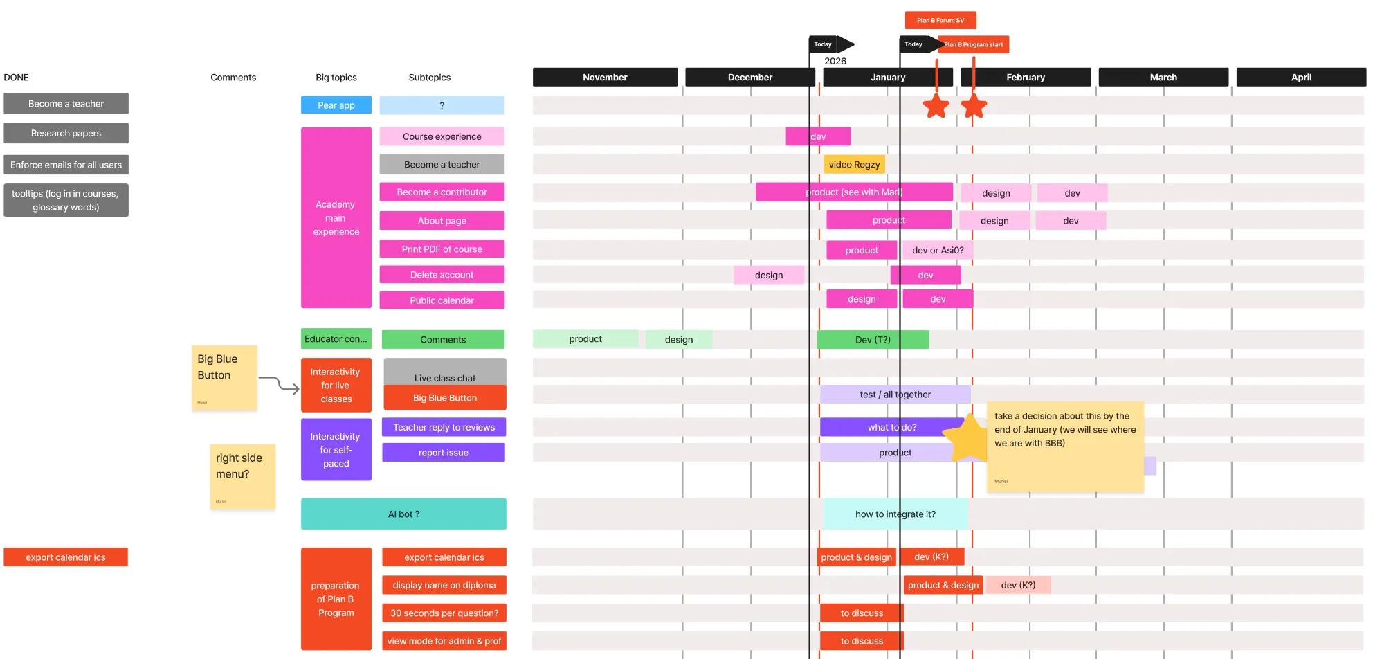
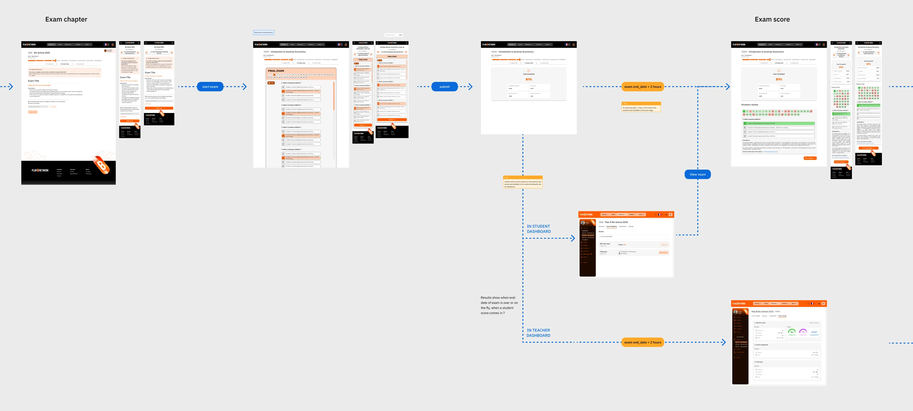
Product roadmap · online exams
Designing an open-source platform
The platform was built on a fully open-source architecture, organised around two distinct Git repositories: one held the educational content (courses, tutorials, resources…), the other the e-learning application.
One of the main challenges was getting these two building blocks to talk to each other, to ease future development while letting the community contribute freely to the content.
In particular, we designed a collaborative translation system letting volunteers gradually improve the resources in around fifteen languages.
Over the months, uses multiplied: online payments, intensive programmes with live classes, notifications, personal calendars, in-person events, selection processes, timed exams, video replays, certificates…
Every new feature had to find its place in a product that was gradually becoming a genuine ecosystem.
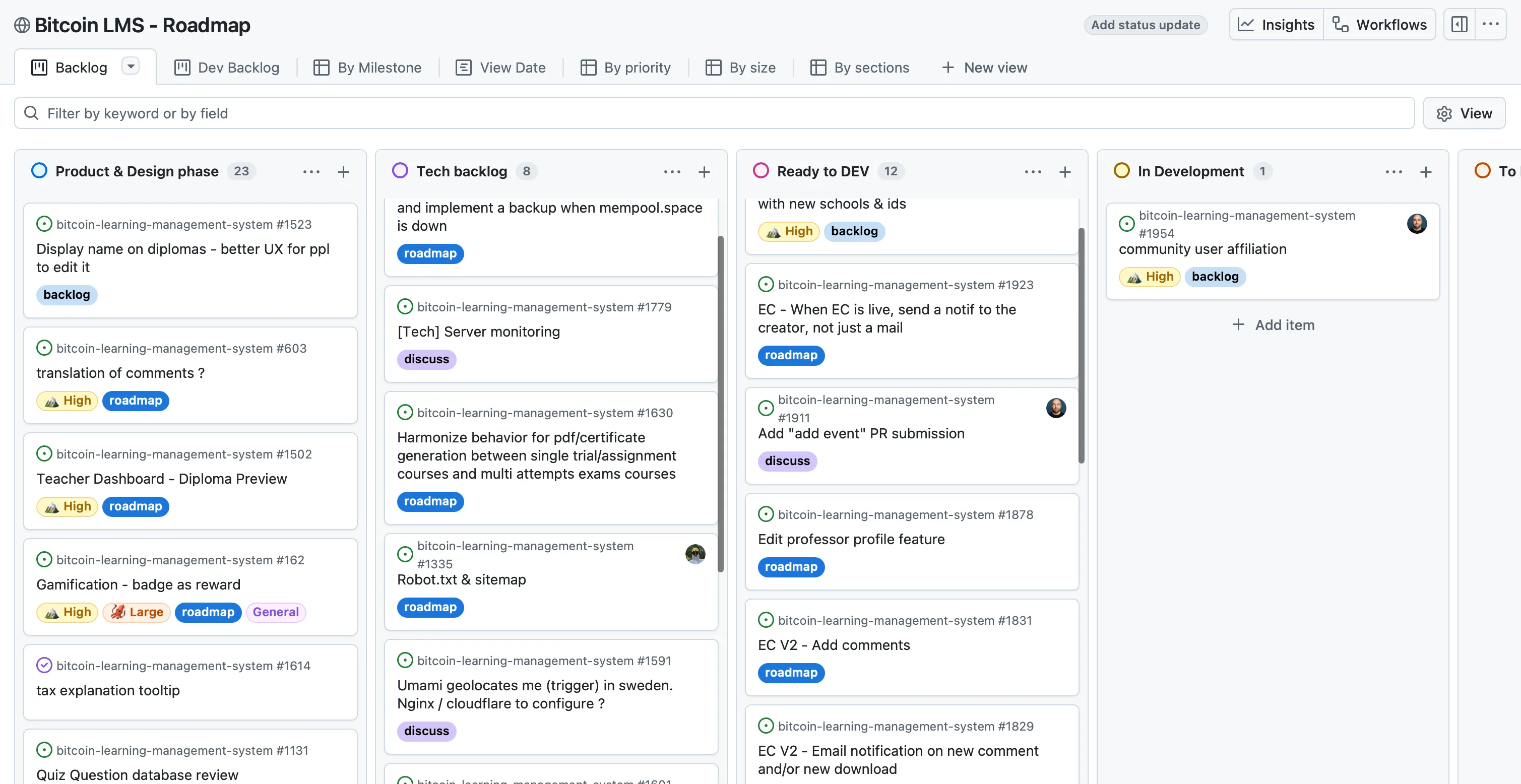
Educational content and roadmap, open on GitHub
Giving the product direction
As the company grew from four to more than twenty-five people, user feedback multiplied.
Students, teachers, local educators, contributors or internal teams: everyone brought their own vision, needs and frustrations.
The Product Manager's role wasn't to add every requested feature. It was to understand the problems hiding behind that feedback, weigh them against the product vision and set the right priorities.
So a large part of my work was analysing this feedback, building a coherent roadmap with the development team and arbitrating development to focus our efforts on the features with the most value for users.
When this double responsibility — UX and Product Management — became too much for one person, I hired a UX Designer to share the product design, structure the design system and safeguard the coherence of the user experience across the whole platform.
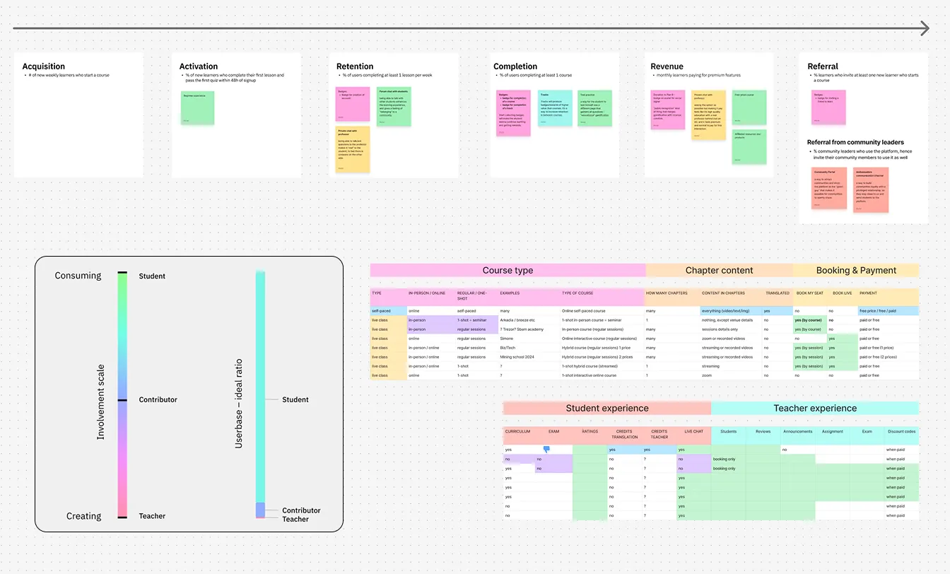
Analysing feedback, prioritising the work
Growing the product
In two and a half years, the platform went from a simple MVP to a genuine learning environment.
It welcomed several thousand students, offered asynchronous paths and live courses, international events, a full collaborative translation system, exams, certifications, as well as dedicated tools for teachers, educators and administrators.
This growth came with a significant increase in the product's complexity.
Rethinking the learner experience
Originally, the site combined both the e-learning platform and the presentation of Plan ₿ Network's various activities.
As the company developed, this organisation gradually became a hindrance. Content tied to events, the community or other projects disrupted the learners' experience, forcing them to navigate an environment that had grown too rich and sometimes confusing.
So we decided to split the ecosystem into two distinct products: planb.network, dedicated to the community's activities, and planb.academy, entirely focused on learning.
This transition was an opportunity to rethink the user experience in depth. With the new UX Designer I had hired, we reworked the information architecture, simplified the journeys, clarified navigation and designed a smoother interface, built for both desktop and mobile.
Our goal was simple: remove all unnecessary friction so users could focus on what matters: learning.
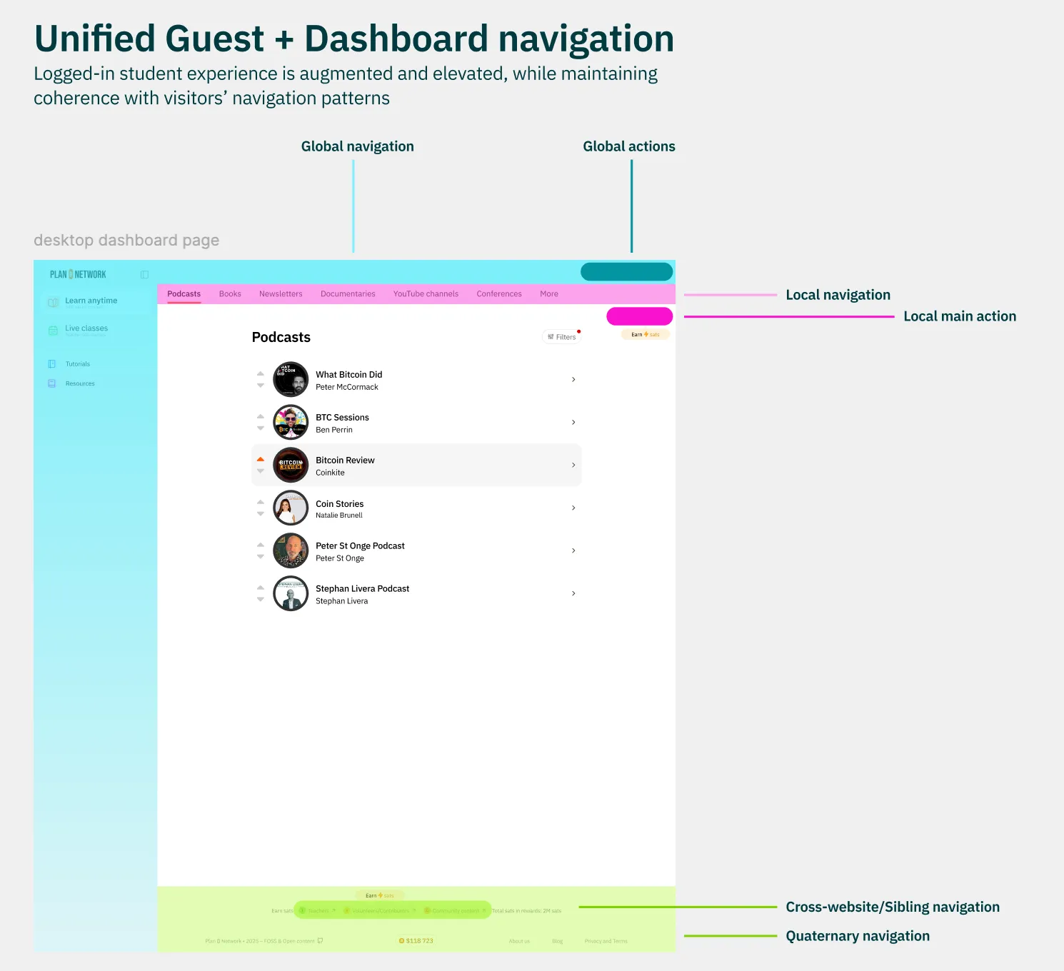
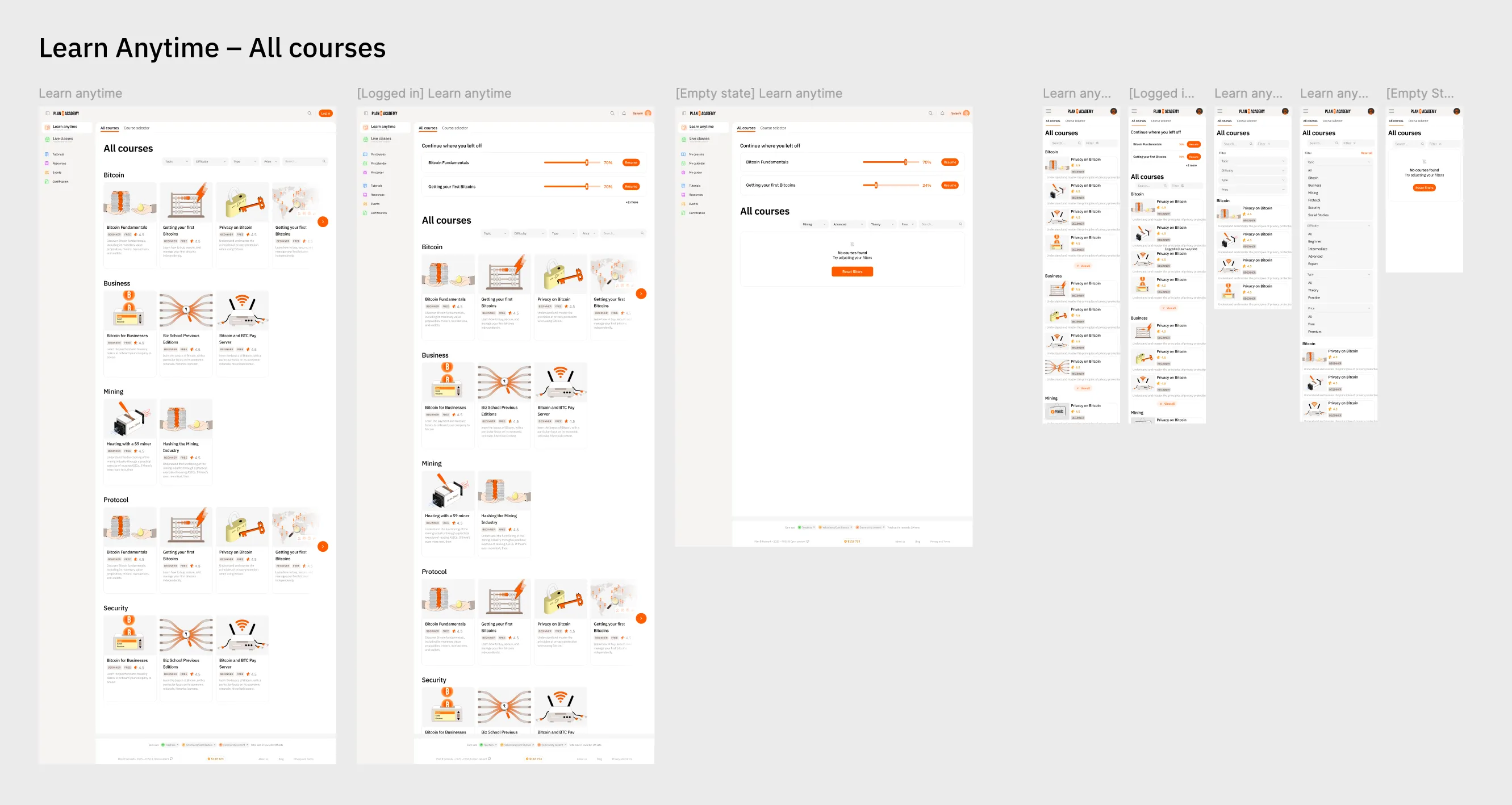
Reworking the architecture and journeys · self-paced learning
Role
- First designer in the company — from UX / Product Designer to Head of Product & Design
- Product Management: product vision, roadmap, specifications, prioritisation
- UX / UI: user journeys, interfaces, design system
- Hired and managed the first designers
- Coordinated design ↔ tech ↔ content ↔ operations
Skills