Plan ₿ Visual Language
Art Direction & Brand Identity · Plan ₿ Network · 2023 – 2026
Designing every brand touchpoint
As Lead Designer, and later Head of Design at Plan ₿ Network, I was responsible for the company's visual communication for more than two years. I designed marketing assets, social media visuals, event materials, product illustrations, and progressively consolidated the company's visual identity across every touchpoint.
As the company grew, my responsibilities expanded to Product Management. I eventually hired and mentored a junior graphic designer to help scale the production of visual assets while ensuring consistency across the brand.
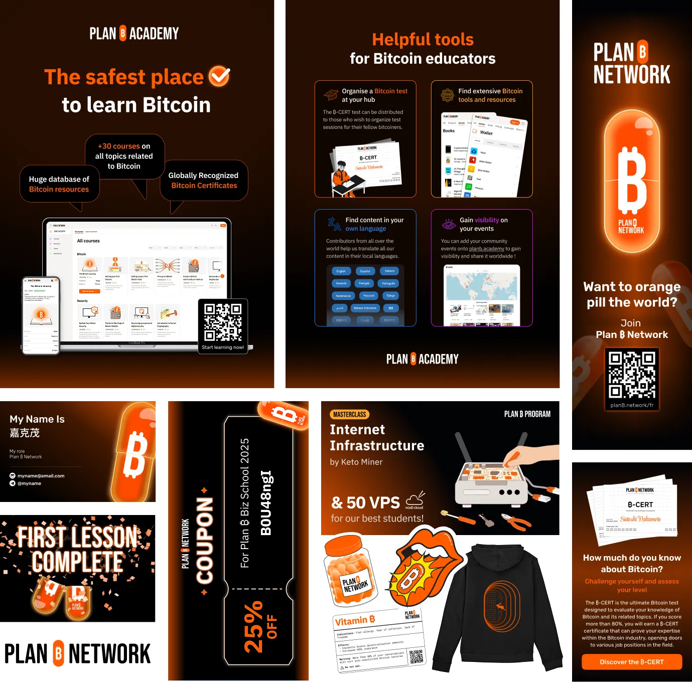
A company reaching a turning point
As Plan ₿ Network expanded, two distinct activities were emerging.
On one side, the Network focused on professional networking, conferences, live classes and events. On the other, the Academy had become a fully-fledged online learning platform with dozens of courses and thousands of learners.
Both were still sharing the same visual language and website, although they now served different audiences and different goals. The Academy needed its own identity: one that would remain connected to the parent brand while clearly expressing its open and accessible approach to education.
This evolution also called for a clearer digital structure. We decided to split the existing ecosystem into two distinct products: planb.network, dedicated to the Network's professional activities, and planb.academy, entirely focused on the learning experience. Each product would have its own website and its own visual identity while remaining part of the same Plan ₿ ecosystem.
At the same time, user feedback revealed another issue. As the course catalog grew beyond thirty courses, the existing thumbnails had become too busy and difficult to scan. Learners struggled to quickly identify the content they were looking for.
The challenge was therefore twofold: create a distinct visual identity for Plan ₿ Academy while designing a scalable illustration system that would improve readability across the platform.
Designing a scalable illustration system
I started by defining a clear design framework.
The illustrations had to work in every language without relying on text, remain instantly recognizable at small sizes, and communicate the subject of each course in only a few seconds.
To achieve this, I established a series of design principles:
- No embedded text, ensuring every illustration remained language-independent.
- A maximum of three visual elements per thumbnail to reduce cognitive load.
- Objects chosen for their immediate association with the course topic.
- Flat illustrations instead of photography, creating a cleaner and more timeless visual language.
- Consistent composition and perspective across the entire library.
The objective was to create visuals that complemented the course title rather than competing with it.
Education often suffers from looking either too institutional or overly playful. My goal was to find a balance: accessible, contemporary and visually coherent without becoming repetitive.
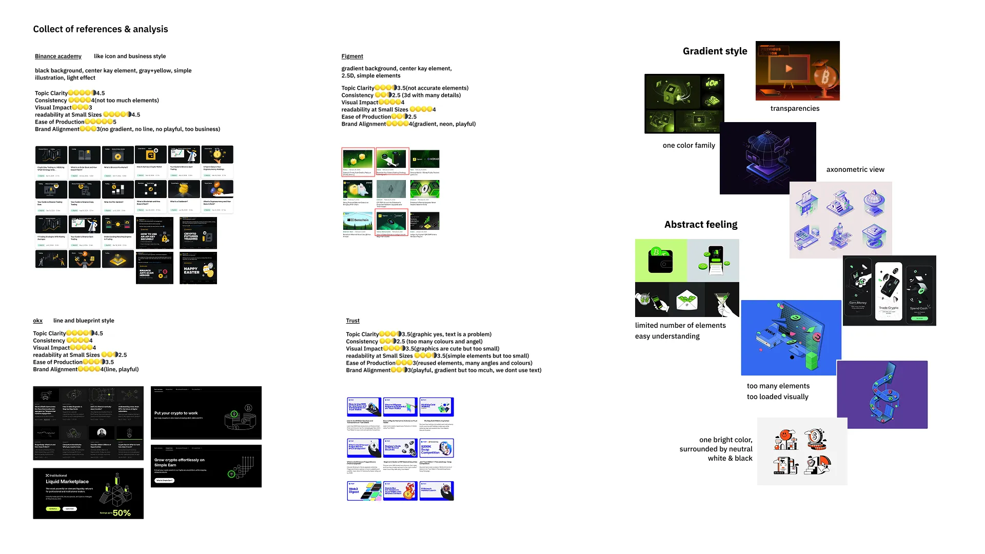
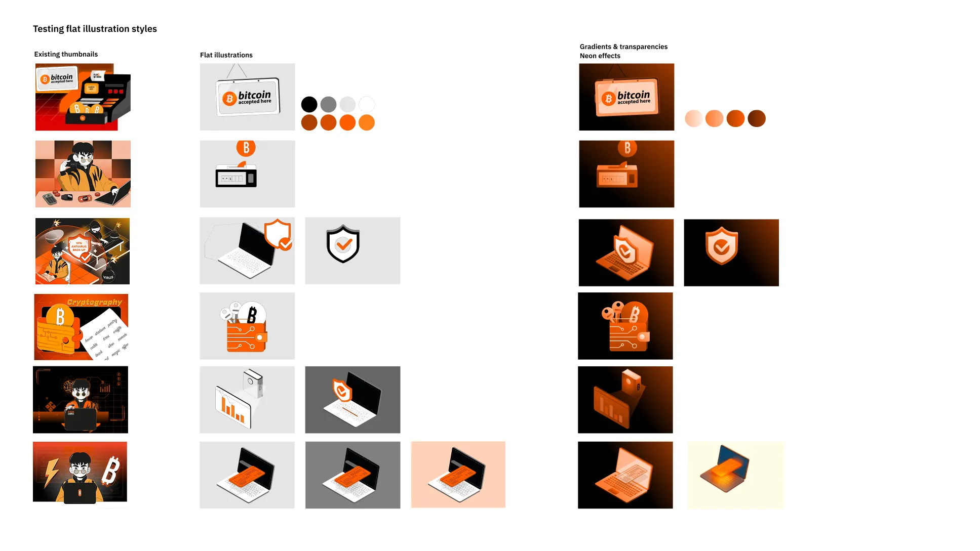
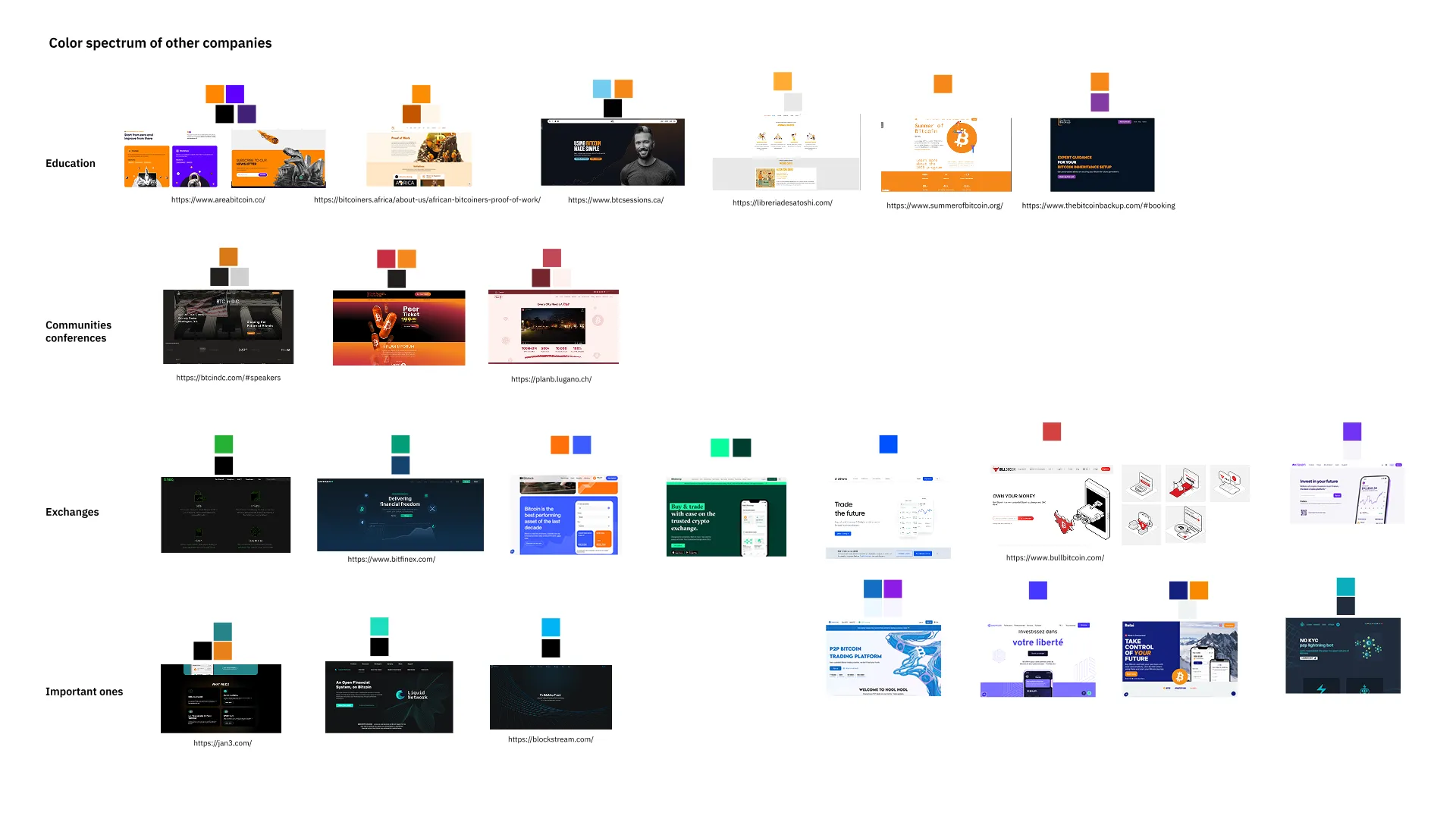
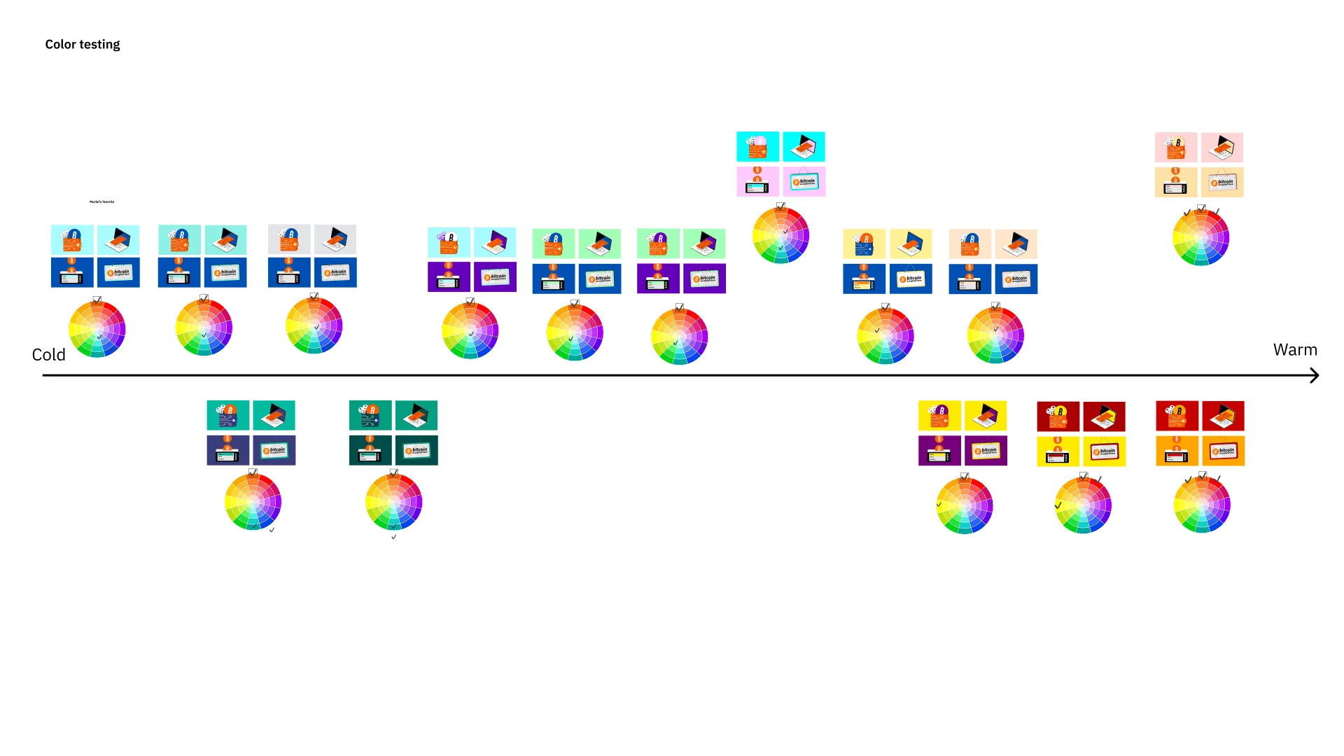
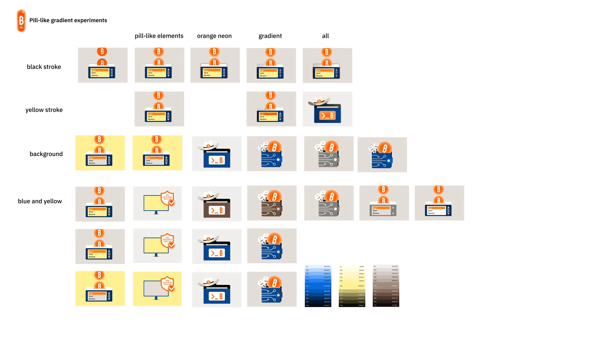
After exploring several visual directions, we settled on an illustration style that brought these requirements together. It integrated naturally with the new e-learning interface, reflected the Academy's open and accessible positioning, and retained a clear visual connection to the Plan ₿ mother brand.
Just as importantly, the style was designed as a system rather than a collection of individual illustrations. Its simple shapes, limited number of elements and consistent visual rules made it easier to reproduce, maintain and extend as the course catalog continued to grow.
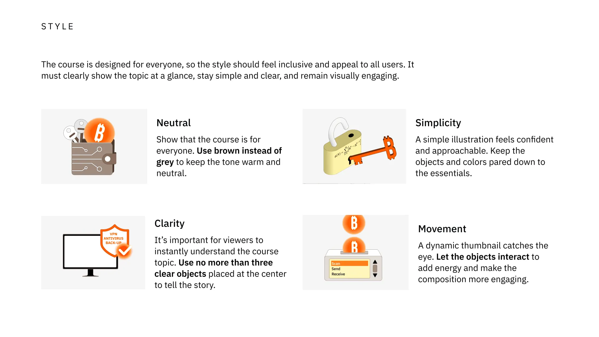
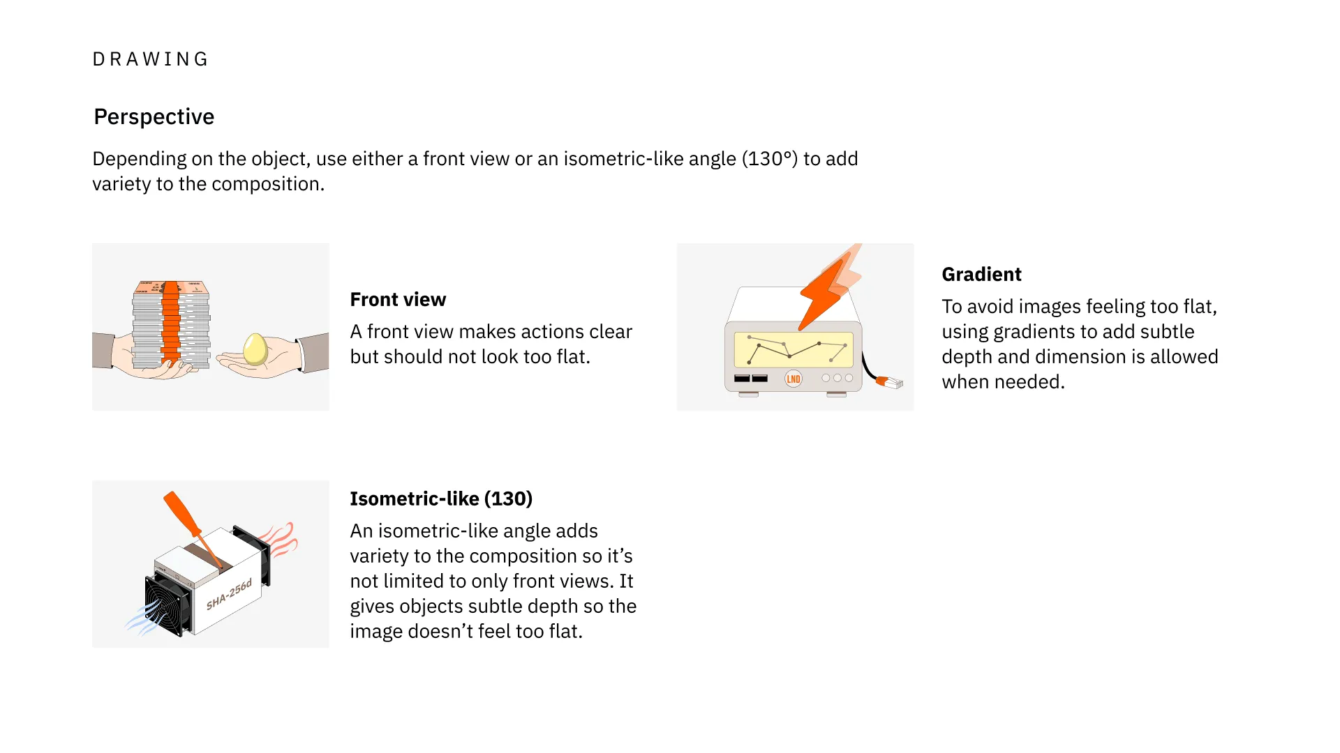
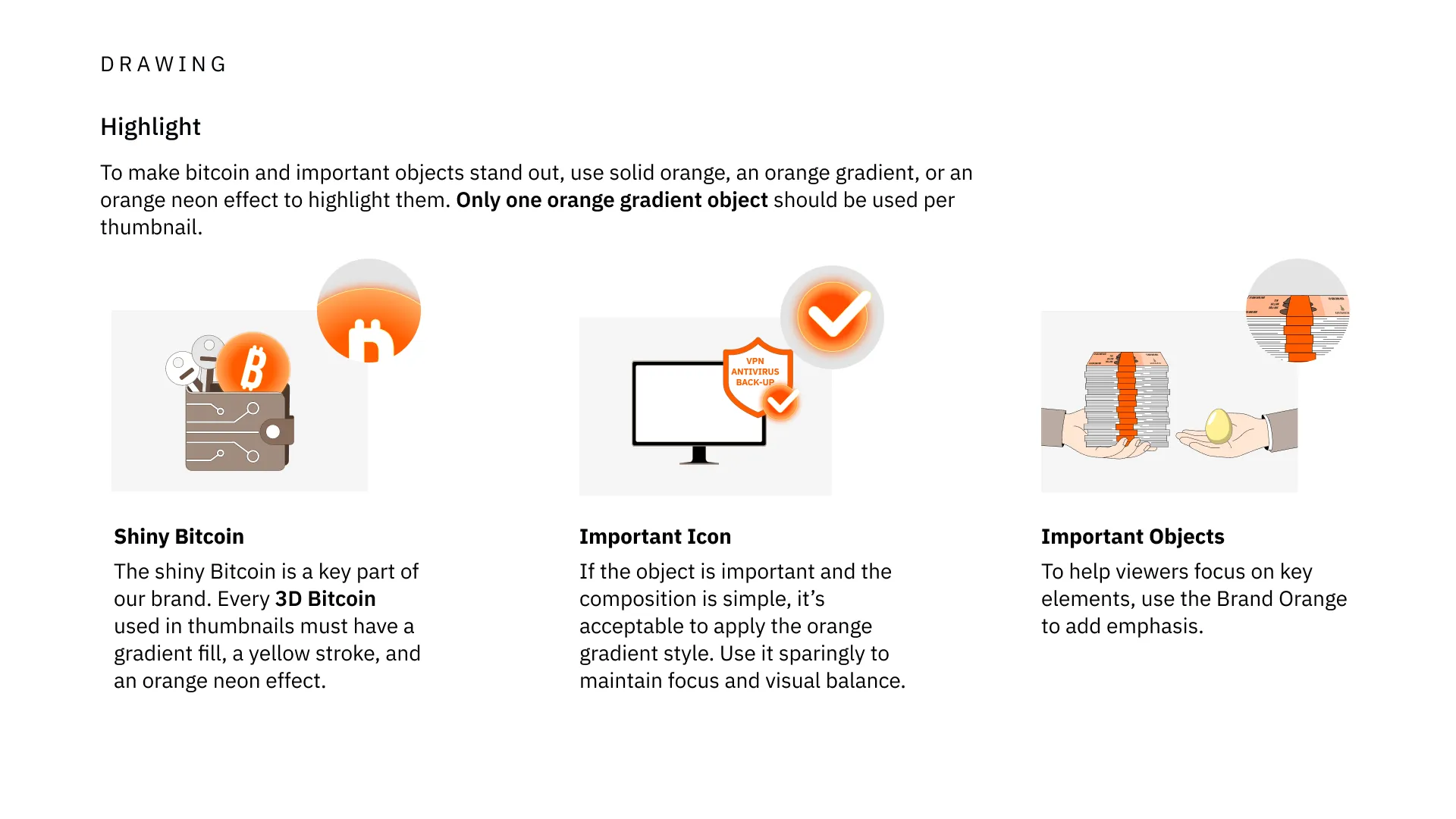
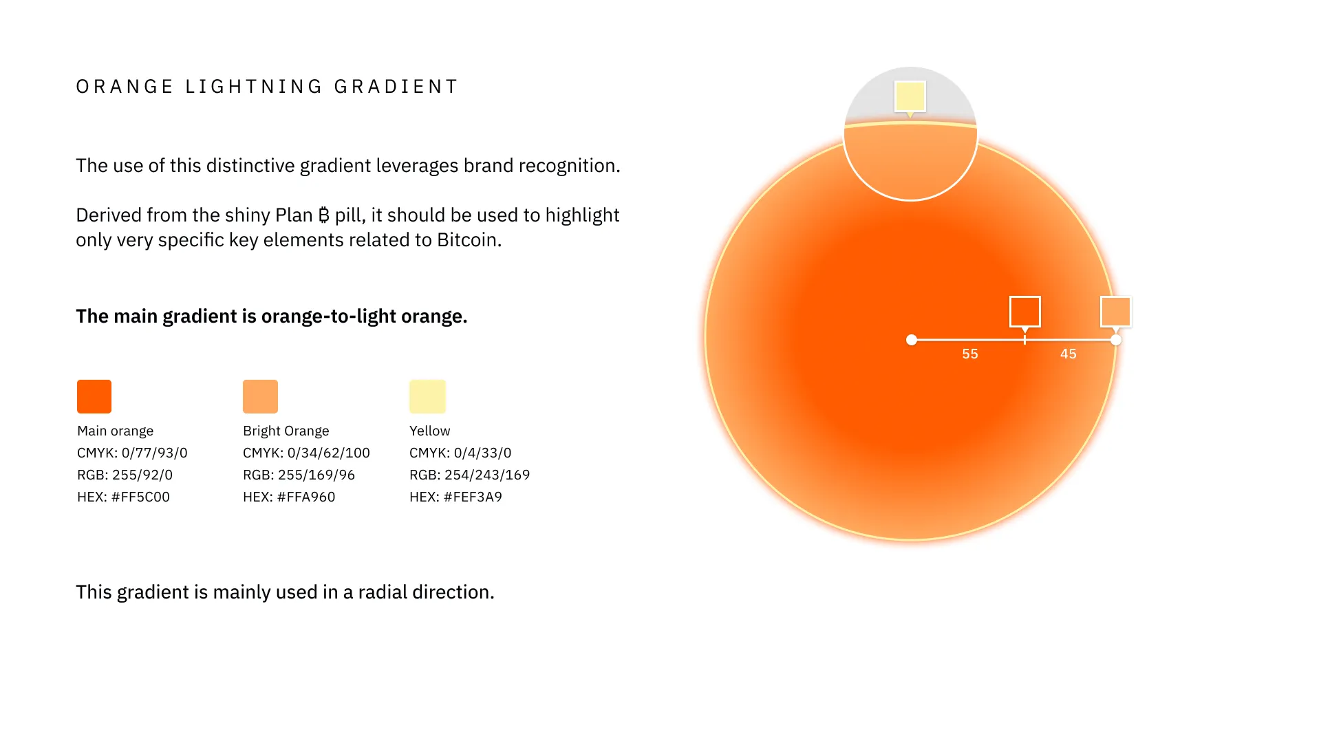
Illustration guidelines and final illustrations from the brand book.
Creating a sub-brand identity
Alongside the illustration system, I developed a dedicated visual identity for the Academy.
Rather than creating an entirely separate brand, I derived it from the existing Plan ₿ identity. The signature orange gradient — already a recognizable element of the mother brand — became one of the strongest visual links between the two identities, alongside shared typography and graphic principles.
The Academy adopted a predominantly light visual environment, contrasting with the Network's established dark identity. Beyond differentiating the two products, this contrast reflected their different positioning: the Network is professional and premium, while the Academy is free, open-source and accessible.
The relationship between the two identities was designed around a clear brand hierarchy. When both brands appear on the same communication, Plan ₿ Network remains the primary visual environment as the mother brand, while Academy content is introduced through distinct light elements within it.
This system allows both identities to remain clearly differentiated while still feeling unmistakably part of the same ecosystem.
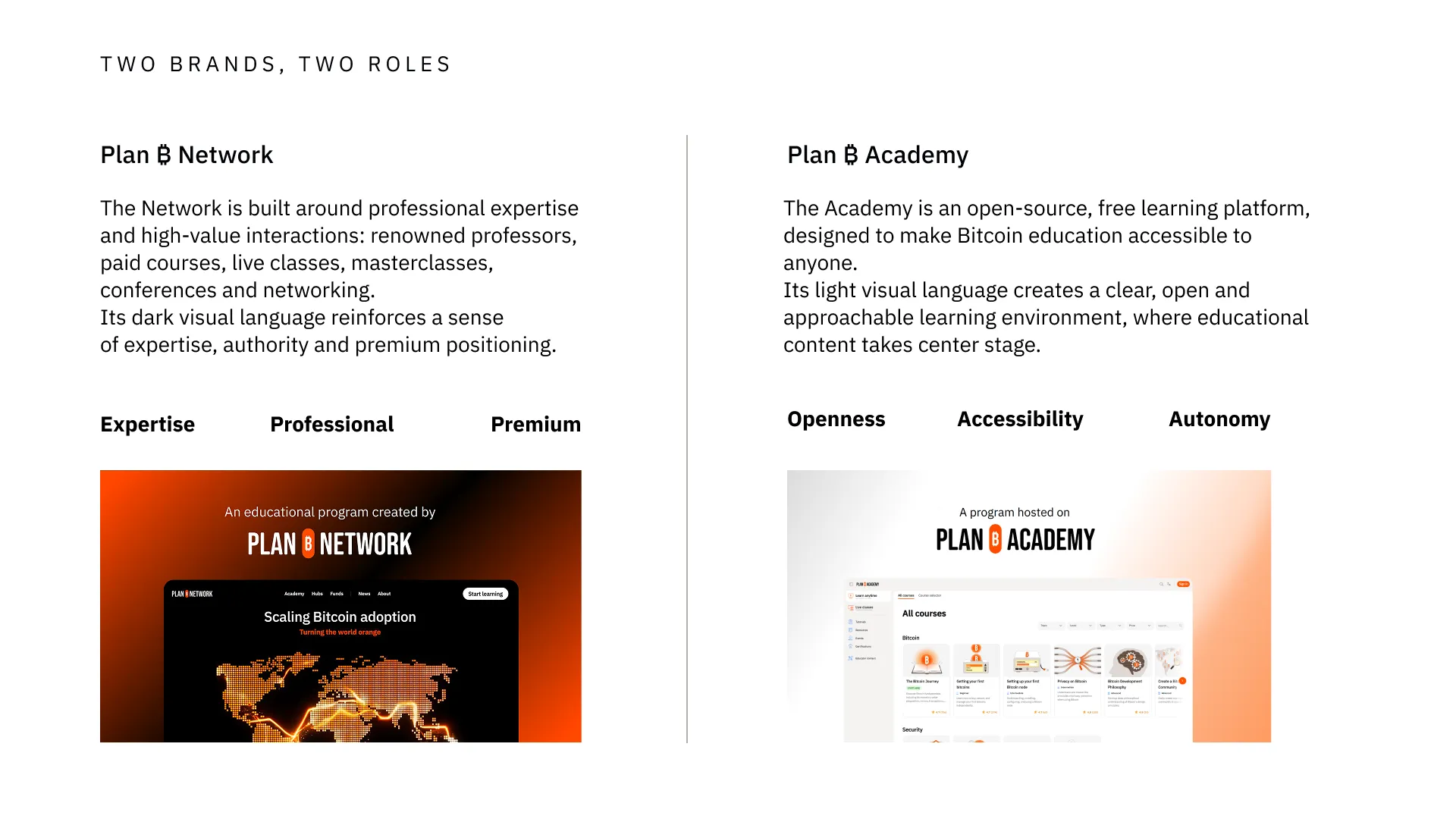
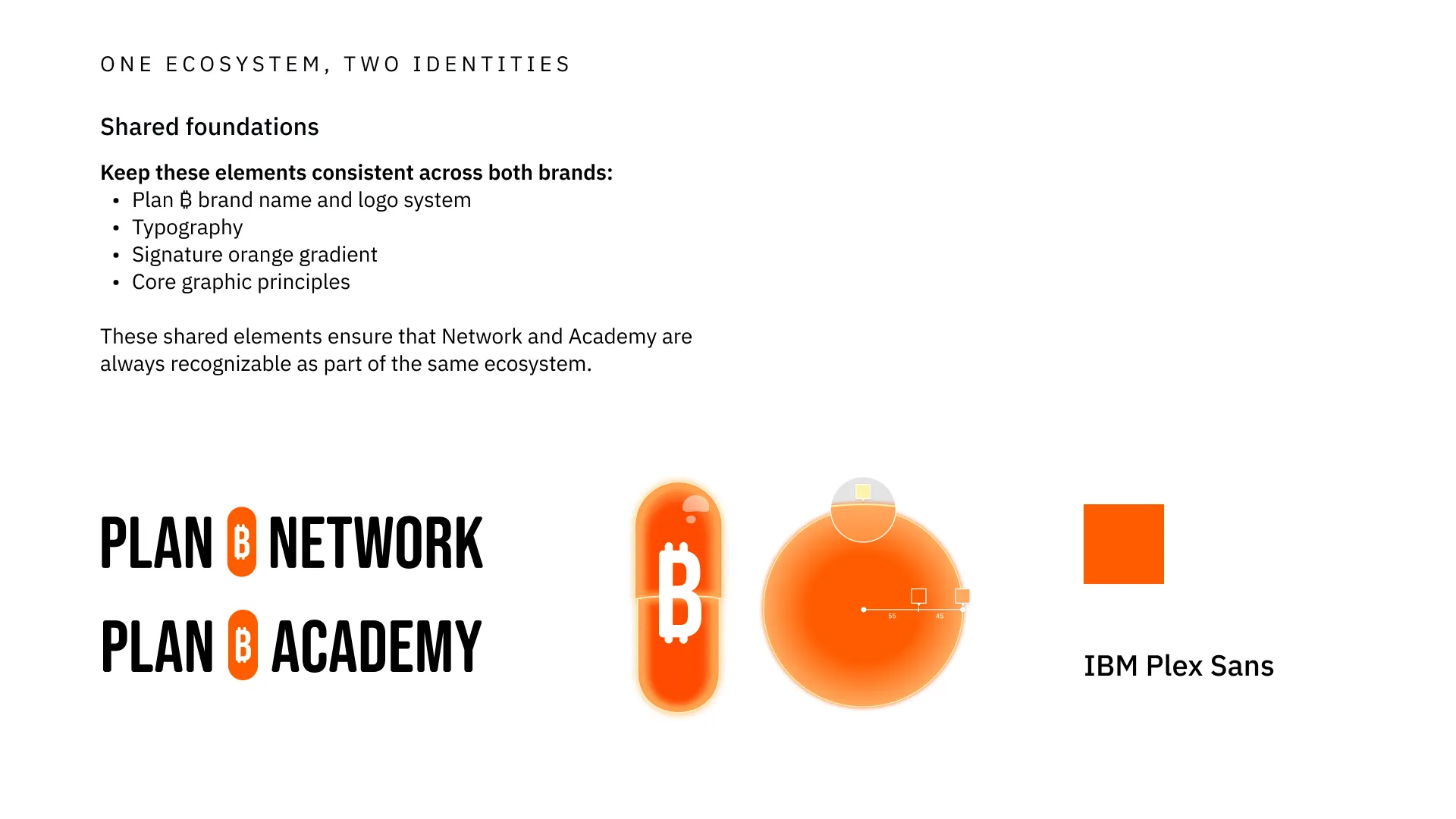
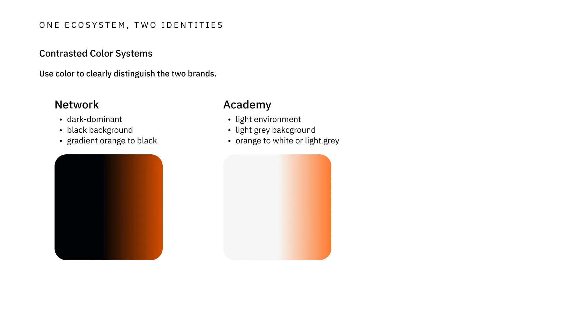
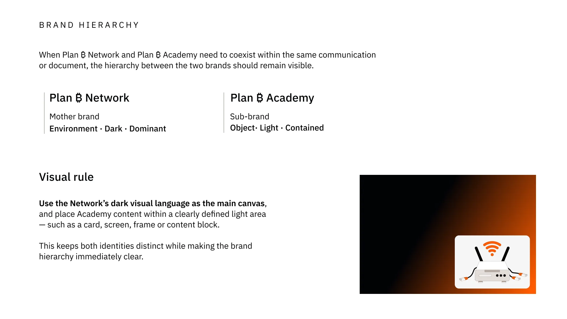
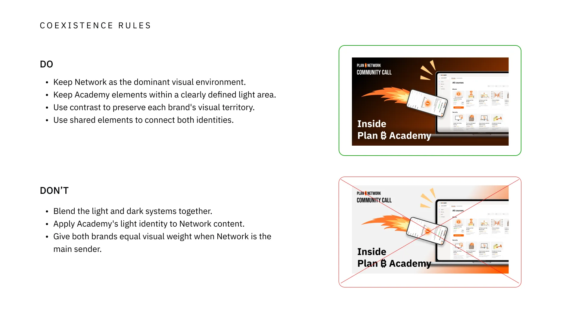
Brand architecture and coexistence guidelines from the brand book.
From brand identity to product experience
The new identities were carried through to the two digital products. planb.network was redesigned around the Network's dark, professional visual environment, while planb.academy adopted the lighter identity developed for the learning experience.
Rather than simply applying two different visual skins, each website was designed in coherence with the role and positioning of its respective brand. Together, they made the new structure of the Plan ₿ ecosystem immediately visible while maintaining a strong connection between the two products.
The design and development of the Academy itself — including the platform architecture, user experience and feature development — is presented in a separate case study covering my role as Head of Product.
 Network
 Academy
Plan ₿ Network and Plan ₿ Academy website screenshots.
Role
- Lead Designer then Head of Design — Plan ₿ Network (2023 – 2026)
- Art direction and brand identity
- Marketing materials, social media, events, product illustrations
Skills